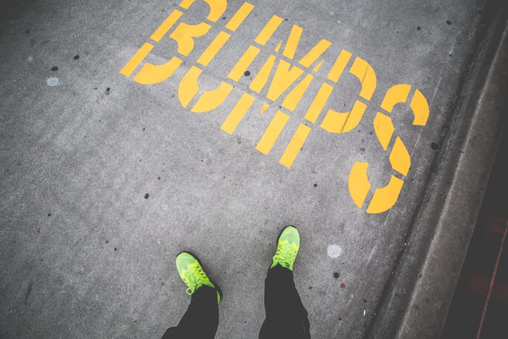
These are the ten tips you’ve been looking for to help you get through that ‘To Do’ list faster. […]
Ten tips to help designers get stuff done faster


These are the ten tips you’ve been looking for to help you get through that ‘To Do’ list faster. […]

If you’re a digital designer, how good are you at receiving feedback? […]

The highly anticipated announcement for Pantone’s 2016 Colour of the Year has been made. This year, Pantone have selected not one colour, but two colours. Graphic design records may have been broken with this year’s two colour choice of Rose Quartz and Serenity. […]

How long does it take for someone to decide whether they like or don’t like your website? Surprisingly (or perhaps not so surprising) some studies suggest that it takes less time to blink than it does to form a lasting impression of your business online. Whether it’s 0.05 seconds or 15 seconds, we know that […]

It’s now time for the final chapter in iFactory’s series on famous typographers. We started with the sans serif styles of the Swiss masters Adrian Frutiger and Max Miedinger, and looked at the classical influence of John Baskerville’s transitional fonts. And now, for our fourth and final instalment, we’ll be looking at the often controversial […]

In typography there are two basic ways to style letters – with serifs, or without. Serifs are the lines added to the strokes of letters to make them more defined – and in modern times sans serif typefaces are supreme, prized for their clean lines and elegance. But fonts using serifs have their place too, […]

Helvetica is a very stylish font. For many decades, Helvetica has been the go-to typeface highly favoured by graphic designers and anyone looking for a simple, elegant and bold look. Created by Swiss born Max Miedinger in 1957, this deceptively simple sans serif type was first known as Neue Haas Grotesk, but in 1960 that […]

The English poet John Keats wrote, “a thing of beauty is a joy forever.” But just imagine if he’d published that line using a font like Comic Sans – you’d hardly take it seriously! Fonts are the size, weight and design of a typeface, governing the way each individual letter is presented, which greatly influences […]

It’s important to get the font right for your graphic design – it can really make or break the look of your site. Many computers offer a host of free typography but sometimes these just aren’t good enough. Often, it’s best if your brand has a unique look that’s completely suited to your company, and […]

A trend that’s emerging in a big way is explainer videos. These are short, animated videos with a specific goal: understanding. Explainer videos are short online marketing videos used to explain your company’s product or service. They use clear and concise language along with entertaining and useful visuals. The typical project takes 4-8 weeks to complete and involves multiple stages. Let’s […]