Everything you wanted to know about Google Material Design (Part 3)
In part three of this four-part series, we explore how colour and bold graphics are set to change how we interact with technology.
We hope you’ve enjoyed the first two parts of our four-part series on Google Material Design. If you’ve missed them, here are part one and part two of the series. In part three of this four-part series, we explore how colour and bold graphics are set to change how we interact with technology.
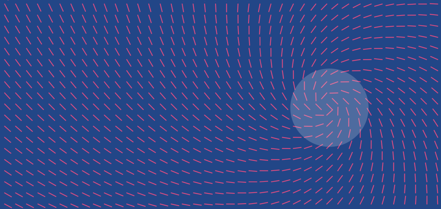
Bold design
Bold, intentional and colourful design, to be more specific. The design elements of Google Material Design will not only be aesthetically pleasing, they will harness all of the basic principles of print design. This includes changes to typography, colour, imagery, grids, scale and space. All of these elements will come together to create meaning and guide the eye toward focal points. The idea is to immerse yourself in the experience, so Google’s material design will use lots of intentional white space and reach the edge of your device, whether that be PC, smartphone or tablet.
Imagery
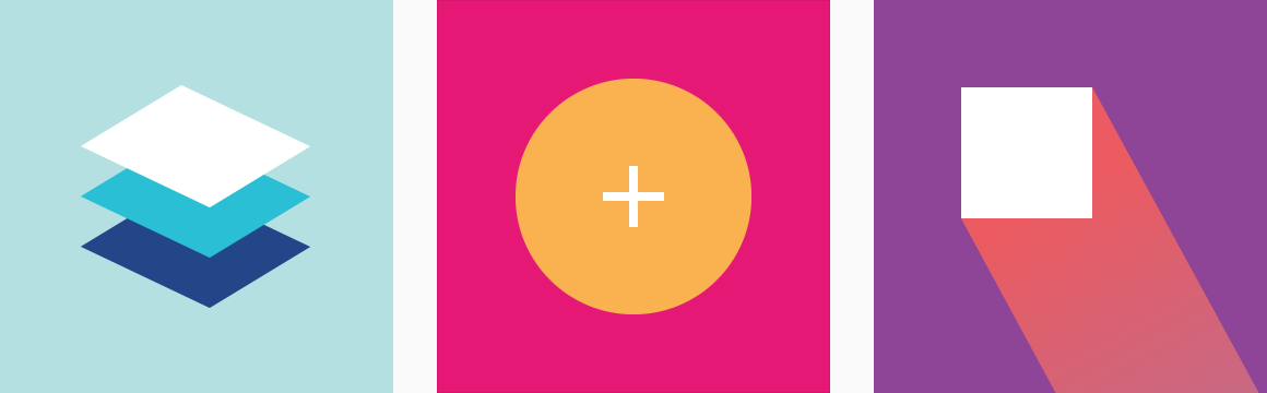
Rather than just decoration, imagery will be used to bring your visual brand to life. The principles of bold imagery are: relevant, informative and delightful – whether your mood is intended to be bright and cheerful or subtle and muted. Images will have clear focal points and use powerful and iconic visual heroes.
Colour
Google Material Design will incorporate colours that are both vibrant and unexpected. Primary, secondary and accent colours make up a complete palette. Accents are used for floating action buttons and other elements including progress bars and links.
Icons
Simple, bold and appealing, icons in Google’s material design will be a friendly visual expression of the brand. Google use their own envelope (Gmail) symbol to show how physical, tactile materials are used as inspiration. The envelope shows how real life and technology should weave together to create geometrically pleasing symbols and icons that are grounded in reality and then used consistently.
Other elements of Google Material Design include typography, text and motion. We know you’ll want to know all about how the words look on the page, so tune in for our fourth and final instalment of this four-part series on Google Material Design. iFactory are experts at all things digital. Our enthusiastic mix of web developers, digital marketing specialists work alongside our creative team of digital designers to ensure that our clients can harness the power of bold design in all their projects. Call our award-winning team to discuss how we can deliver bold designs to enhance your brand.