Colour basics: Hues, Tints, Tones and Shades
It’s time to get back to basics. We look at the colour theory design principles of hues, tints, tones and shades.
Colour plays a vital role in good web design. It has the power to evoke particular emotions in your website visitors, which influences how that person views and interacts with your brand. Those who are web designing understand that colour can be used as a way to focus people’s attention on certain elements of a website, driving them towards a journey to conversion.
Colour theory: Science vs traditional
A designer in the digital era gets that you don’t have to stick to a fine artists approach to colour mixing. That’s because choosing the right colour, particularly in brand and advertising, depends on a scientific approach. A designer must balance the complex nuances of mood, emotion, perception, cultural and personal meaning to create attractive and effective design. Despite this scientific methodology, there’s a lot a designer can learn from traditional colour theory to decipher what colours work well together and how they can adapt the colour to create a different mood.
It’s all about understanding the fundamentals of colour theory. Let’s go back to school to understand the basics behind hue, tint, tone and shades.
Firstly, let’s understand the elements of a colour wheel
Upon first glance, the colour wheel acts as a tool to understanding primary, secondary and complementary colours. Yet, it is more complex than it seems. It defines analogous colours (any three colours that sit side-by-side), split complementary colours (which reflects the two colours neighbouring a harmonising hue) and tetradic colours (an assemblage of four colours, including two complementary colours).
Beyond looking at colour that balance each other, the colour wheel offers a place in which hues, tints, tones, and shades can be identified.
Hue
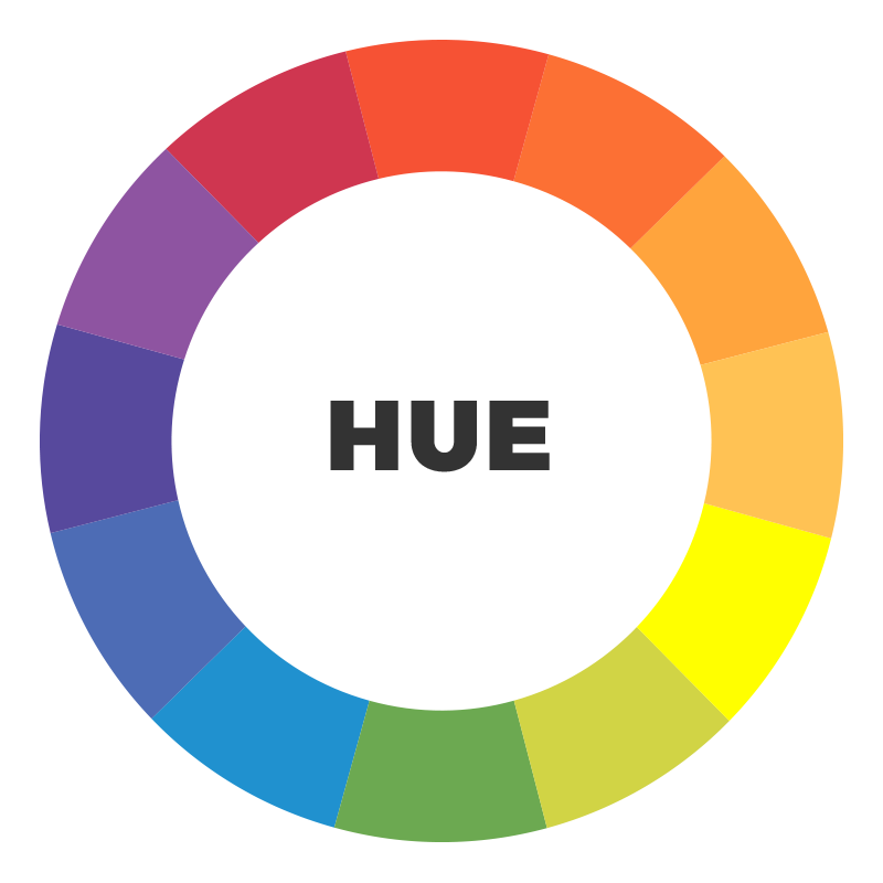
Many people, including artists and website designers, use hue and colour interchangeably. It’s understandable to presume they mean the same thing, but technically speaking they are slightly different. A hue refers to the dominant colour – or pure spectrum colours – in a colour family, one without black or white pigment.
Tint

A tinted colour occurs when you take the original hue and add white to it. In essence, you are creating a tint of that hue. For example, if you were to add white to red, you are tinting the colour lighter to appear pink.
Shade

A shade has the opposite effect of a tint. By taking any colour or hue and adding black to it, you are creating a shade of the original colour. For example, mixing a small amount of black with blue could create a navy or oxford blue. While mixing black with red could transform the colour to garnet.
Tone
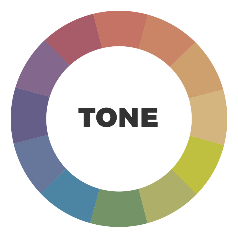
A tone refers to a less intense, or duller, version of a colour or hue. To tone down a colour, all one needs to add is grey. For example, mixing a small amount of grey with red could create a chalky red or dull pink.
Of course, there is a whole world of colour theory to explore and its relation to branding and identity. We have only just tapped the surface. If you’re interested in reading more about colour theory, be sure to read our four-part colour theory series on the topic.
iFactory are a creative and digital agency, specialising in web design in Brisbane. If you’re interested in finding the right colours and mood for your brand, our team of digital marketers and web designers based in Brisbane can help you create a corporate identity that symbolises and communicates your business purpose. Get in contact today to discuss your digital needs.