Experience peak nostalgia with these website design trends from 1997 – 2019
It’s been a long, strange trip on the internet.
We like to compare late-90’s website design to a chaotic house party. There’s music, but you don’t know where it’s coming from, everyone is talking in ALL CAPS and someone decided multiple strobe lights was a good idea. If you want to make a quick exit, you better employ a Matrix-style strategy for getting out alive.
The definition of “good website design” has changed over time. In the beginning, there wasn’t even web design at all. The first websites that came along shortly after Tim Berners-Lee crafted the World Wide Web and were designed primarily for text-only browsers like Lynx. For a time, flashy web design was simply adding exclamation marks to sentences. Even when the Mosaic browser allowed for the addition of images things were still archaically simple.
It’s fascinating to look back at early websites and see how far they (and the entire internet) have come. Let’s jump into the iFactory time machine and see how our Gen-X ancestors viewed the world.
Hottest trends 1999 – 2004
The average monitor resolution in this era was a whopping 800 pixels wide by 600 pixels high, which is a fraction of the screen you’re using to read this article now. This, coupled with the prevalence of dial-up modems providing connectivity, meant that early websites didn’t have many detailed images. Where images were found, however, they were garish and weird, because we didn’t really know what we were doing.
Early internet functionality included hit counters (a simple, and easily exploitable, precurser to modern website analytic systems), Flash (which allowed for animations and special effects on a website, but required a separate plug-in to work correctly) and frames (a way for pages to load the contents of another page inside a window, which was a bad idea and nobody’s mentioned it since).
Here’s some great examples of this era, preserved in their 256 colour glory:
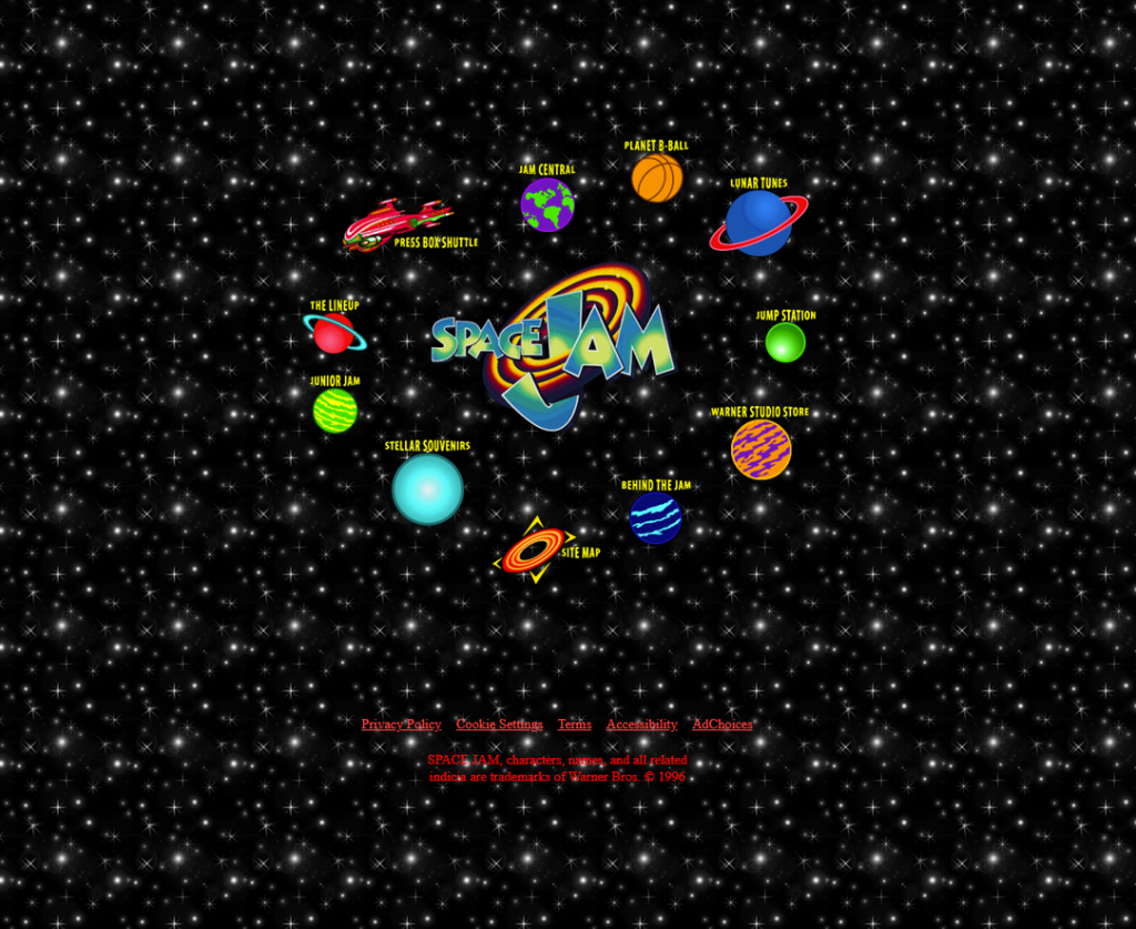
Space Jam
The website based on the movie based on the legendary historical event when Michael Jordan played with the cast of Loony Tunes. The website has all the hallmarks of a ‘90s website: tiled backgrounds, gaudy colour gradients and non-standard menus on every page.
CNN
The early CNN was more like reading a newspaper than anything else, as the page was mostly plain text with an occasional colour change or blurry image to accompany the big stories.

Livejournal
Before social media there was blogging. People would sit down, sometimes for hours at a time, to write a long-form wall of text to update their friends and followers what they were up to over the last few days. Updates were primarily text-only, flourished only by small animated gifs to indicate moods. It was a different world.

Captain Marvel
Technically this is not a 90’s website, but it was designed with a 90’s feel for the release of the Captain Marvel movie in 2019. You can sign the guest book, play the “Can You Spot the Skrull” game and spot the character in the stereogram.

Online life, 2005 – 2010 edition
Technology continues to change, and website design changes along with it. The advent of cable or ADSL connections and higher-resolution monitors allow for larger images, and even early attempts at video. Netbooks and WIFI meant that computer users were no longer tied to a desk. Powerful ecommerce applications grew in popularity and commercial websites changed from being just virtual catalogues to full-fledged shopping destinations.
Amazon
The company was already a household name for books, but things changed quickly once they started selling, well, everything.

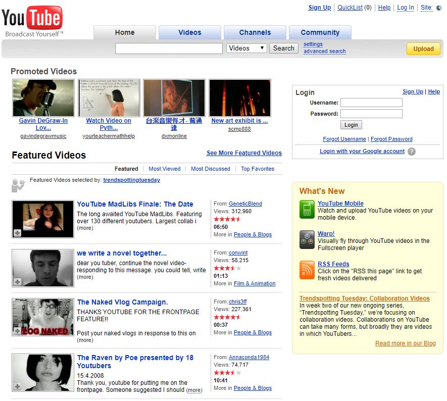
YouTube
Broadcast Yourself, the site beckoned, and people rose to the challenge. Back in this era creating and uploading video was still a challenge for most people, so there weren’t that many new videos uploaded every day. Now there’s 300 hours of video uploaded every minute. No wonder they removed the RSS feed to alert you when a new video was uploaded.
2010 to present day: The only constant is change
Smartphones hit the mainstream, and then everything changes forever. All of a sudden, anyone can view a website at any time from anywhere, and that meant that the idea of a fixed screen resolution web designers could comfortably rely on was a thing of the past. Initially, some developers responded to this by making separate mobile-friendly versions of their existing sites before things settled into a mobile-responsive format that was easier to work with. Video became a default method of conveying a message, and geotargeting made websites deliver relevant information for visitors.
The Drake Group
Designed by iFactory, this company site uses full screen visuals to emphasise the size and performance of their products. Even on mobile, users can easily find the information they’re looking for and contact the team quickly.

Evolution of popular websites
To illustrate how things have evolved over the years, let’s take a look at some sites and see how they looked back in the day. Hold on, things could get rough.
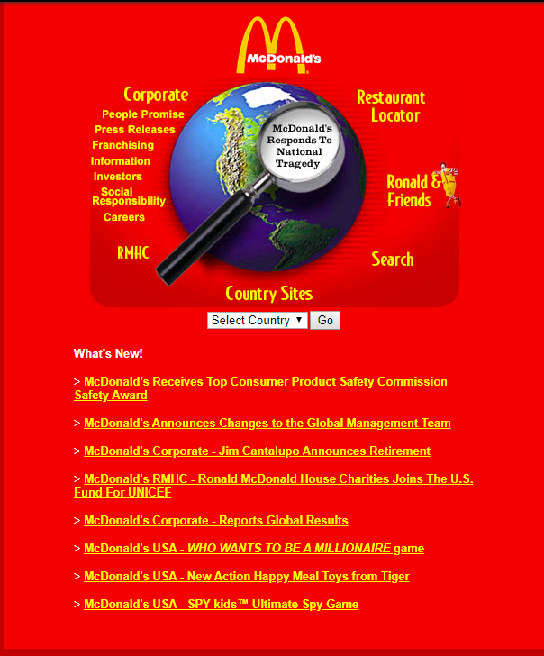
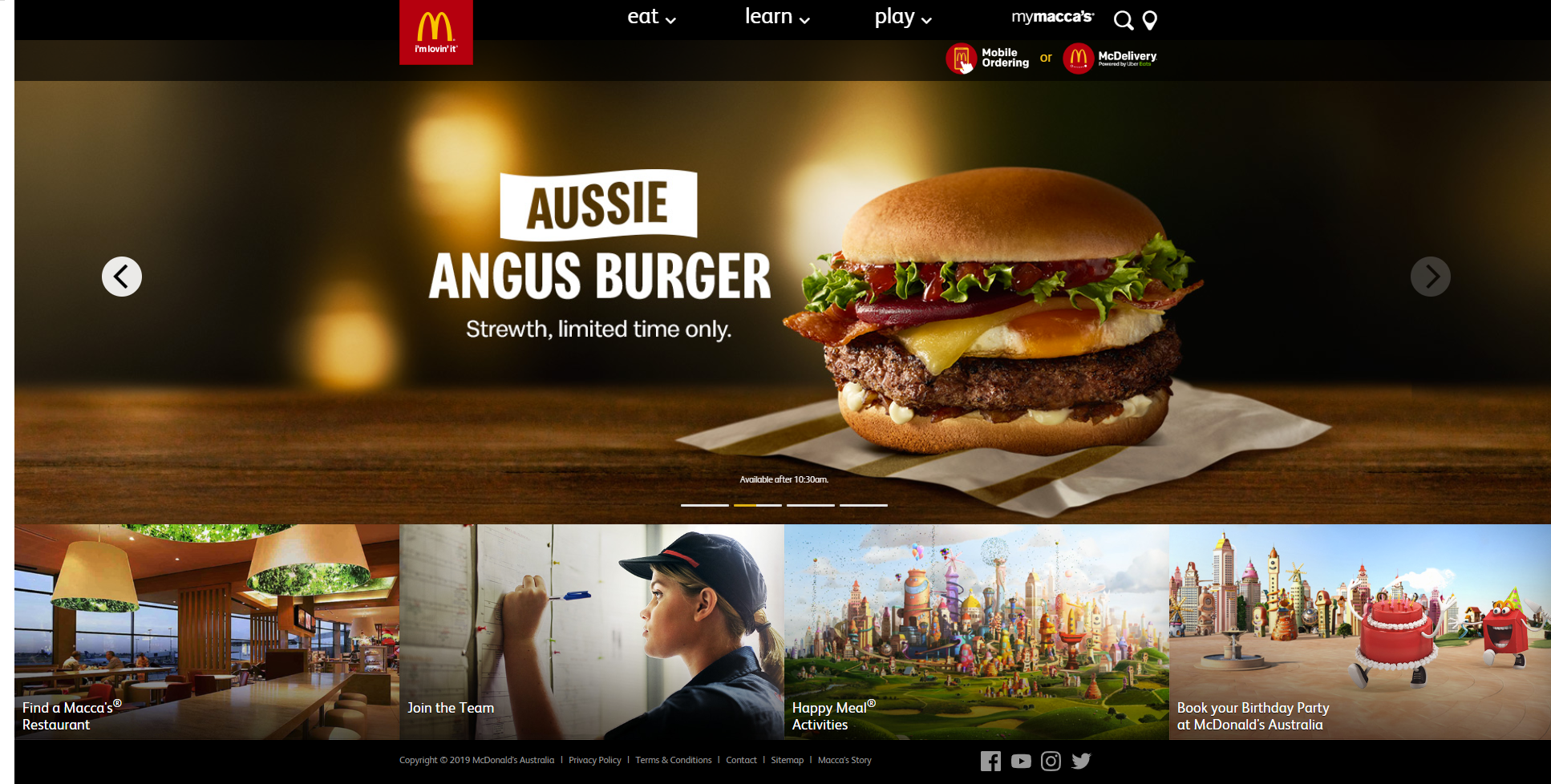
McDonalds
It’s no surprise that one of the largest corporations on the planet were one of the first to get their own website. The 1997 version sported eye-popping colours and a few links to company details, but very little in the way of interactivity or detail. It even had a help button for people confused about how to navigate a website at all. As time moved on the site grew in stature and toned down the copious amount of red everywhere.

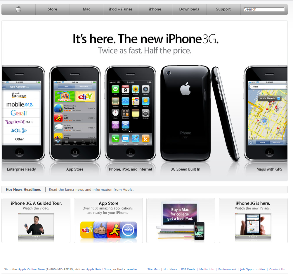
Apple
Early Apple websites tried to emulate the look and feel of using a Macintosh, with a top menu bar that changed depending on what page you were looking at and smooth curves everywhere. When the iPhone came along the site changed to ape that reflective glass that smartphones were known for, and now the modern Apple site boasts full screen imagery that changes as you scroll.


iFactory
Even we’re not immune to growing pains. The iFactory Brisbane website design of yesteryear was a patchwork of text blocks jammed together, each one full of conflicting font sizes and garish orange links. In 2007 it gave way to a more subdued format, which served the company well until smartphones arrived on the scene and a modern and responsive website design was needed. Full screen imagery and smartly written content were the order of the day, pleasing both the eye and the search engine algorithms.


Who knows what’s next for website design? We have some ideas, and we’re working on new websites and applications that are going to push the web even further. Talk to us today about how we can bring your website into the future.