The Golden Rules of Digital Typography (Part One)
These are the golden rules of typography every graphic designer should know.
Words are just words right? Yet much like an illegible doctor’s scrawl on a medical chart, reading poorly laid out text on a screen is downright frustrating. Many digital designers understand that no matter how many bells and whistles are built into a website, every user relies on text to accomplish whatever they’re visiting the website to do.
For this reason alone, typography – the art of arranging type to make written language legible, readable, and appealing when displayed – should be made a priority for any graphic designer. Regardless of whether you’re a beginner to the field or have been designing websites since the dawn of the internet, it’s always helpful to refresh your mind about the principles of typography. In part one in our instalment on typography we dissect eight out of the sixteen golden rules.
1. Typeface in a nutshell
Before computers, typeface referred to the design, while font was the size and weight. Nowadays, these terms are used interchangeably. There are four categories of typefaces that graphic designers use most often:
- Serif
- Sans Serif
- Script
- Decorative
2. Take note of font communication for your audience
Much like colours, each font you use for your digital communications will evoke a different combination of emotions, feelings and associations. Fonts such from the Serif family such as Times New Roman and Baskerville is seen as traditional, respectable, and reliable whereas fonts from the Modern typeface family such as Century Gothic, Didot Italic, and Futura are represented as strong, chic, progressive and stylish.
3. Kern the word
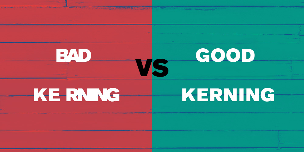
Bad kerning is one of the cardinal sins of the design world, so it’s an important skill to nail down early on. Kerning is the adjustment of space between characters, so that each character is visually even to make for a clean and orderly piece of text. It doesn’t sound like a big deal, but a bad kern job has been known to easily turn an innocent word into an offensive one.
4. Allow your words to breathe
Not every space needs to be filled with text or imagery. White space is a powerful, yet underrated, tool that allows your design to breathe, giving a clearer direction to what you’d like the user to focus on.
5. Show a clear visual hierarchy
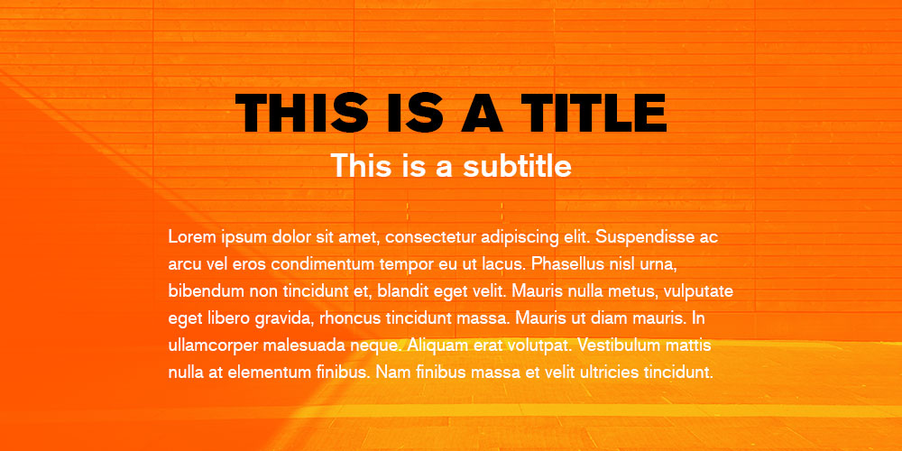
If the words on a webpage were all the same size, it would be difficult to know which the most important information on the page was. Part of User Experience Design is guiding the user where you want them to look through heading and sub-headings, colour, spacing and weight.
6. Limit your fonts
Want to avoid stressing out your website designer? Don’t make a promotional flyer with twenty fonts. If you need more than one font (and most businesses do), try to limit it to just two or three typefaces and align their purpose. Ideally, there should be one font and size for body copy, headers and sub headers.
7. Choose the right font palette
Colour is a powerful tool for both website imagery and fonts. When deciding on your brands font palette, research into the philosophies of colour theory to pinpoint the right colours for your design.
8. Practice correct alignment
Alignment is essential to providing the reader with visual relief. There are five ways to align text: left aligned, right aligned, centered, justified and asymmetrical. All alignments have their pros and cons, but right aligned, centred and asymmetrical text is more difficult to read and should only be reserved for captions, pull quotes and headings.
We hope you’ve found part one in our series on digital typography valuable. Stay tuned for part two. And if you liked this article, you might also enjoy
- Is it a font or a typeface?
- Serif or sans serif: which font is right for you?
- Famous Typographers of Famous Fonts (4 part blog series)
- Free fonts versus paid fonts
- Google Fonts (3 part blog series)
- Five places to find free commercial use fonts
- 7 influential women type designers
iFactory is an established Brisbane digital and creative agency. We’re here to help your business thrive through website design, digital strategy and digital marketing. Contact iFactory today to discuss your creative digital needs.


